
iOS app / Mobile navigation
Workspace369’s iPhone tab bar: native Liquid Glass, measured to the point
The bar at the bottom of an iPhone app is the first thing people touch. This is how Simon made Workspace369’s look and feel like Apple’s own, and how measuring instead of guessing found a hidden 15-point overlap. Under the hood: Apple’s native Liquid Glass tab bar on iOS 26 and later, with a Flutter-drawn twin on older iOS, Android and the web.
Simon’s role: App369 founder Simon Dziak designed and built Workspace369 as his own product, and leads its development. Workspace369 LLC publishes it on the App Store.
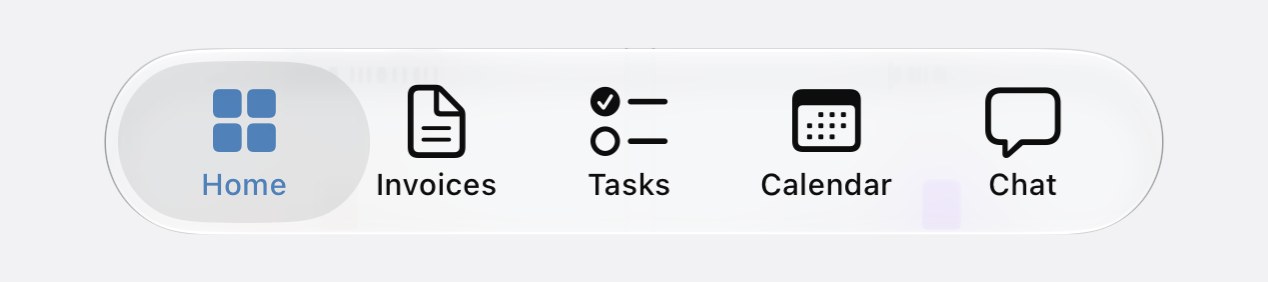
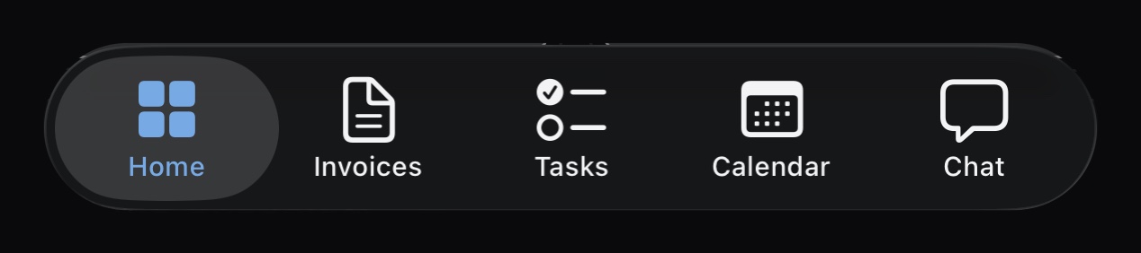
Cropped from iPhone simulator screenshots of the Workspace369 app (build 2026.10.01) taken on November 10, 2026. The fixes on this page changed the spacing around the bar, not how the bar is drawn. The page behind the bar is masked out; the faint shapes inside the glass are the page showing through. The account shown uses a customised set of tabs, not the default, and shows no More button.
The problem
What Workspace369 Needed to Solve
Workspace369 is a Flutter app. On iOS 26 Apple’s own tab bar floats over the page on Liquid Glass, and iPhone users know how it looks and moves. So the bar had to be the real native control on new iPhones and a Flutter-drawn bar everywhere else (older iOS, Android and the web), while behaving as one bar: the same tabs and the same settings. The hard part was the seam between the two. Every page in the app is handed its bottom spacing from the height the bar reports. If the native bar reports the wrong height, content can hide behind it or get pushed off the screen.
The measurement
From About 800 px to 84 pt
Every page’s bottom spacing comes from the box the bar sits in. Here are the three versions of that box, drawn from the pull requests and the simulator screenshots (iPhone 18 Pro, iOS 27.0). Heights in the last two are to scale and the width is squeezed to fit; the first can’t be to scale, because 800 px is taller than the drawing. A point (pt) is Apple’s screen unit, about 1/160 of an inch; the px here are Flutter’s logical pixels, the same size as a point.
Before
Broken~800 px
bottom padding on every page
The native bar sat in a Flutter Stack that took all the height it was offered, so every page was told the bar was about as tall as the screen. Check-in on iOS 27 collapsed to a blank page, and the Files upload button was pushed off the screen.
Found in PR #1418, November 9, 2026
First fix
Overlaps68 pt
the native view’s own height
The box became exactly the native view’s 68 pt. That was honest about the view, but the glass pill draws above its own view: its top sits 83.0 pt above the screen bottom. The last 15 pt of every page ended up under the pill.
PR #1421, merged November 9, 2026
Measured fix
Covers the pill84 pt
68 pt view + 16 pt of room for the pill above it
The box now covers the drawn pill. The pill top sat 83.0 pt up on both simulators (iOS 26.4 and iOS 27.0), so 84 pt clears it by 1 pt. The native view keeps its size and position, and taps in the extra strip pass through to the page.
PR #1423, merged November 10, 2026
Measured from the pixel edges of the pill in simulator screenshots taken on November 10, 2026: iPhone 18 Pro on iOS 27.0 (100% text in dark, 125% text in dark and light) and iPhone 17 Pro Max on iOS 26.4 (100% text in dark). On the straight part of the pill the top edge is 83.0 pt above the screen bottom in every one; in light mode a thin rim starts at 83.7 pt. PR #1423 recorded 81.3 pt for iOS 27.0, a reading taken inside the pill’s rounded end; re-read from the same screenshots on November 19, 2026, it is 83.0 pt. Widget tests pin the 84 pt box, the 16 pt allowance and the content clearance under each bar shape. The record holds no device screenshots taken after the fix.
The build
How It Was Built
On iOS 26 and later the bar is Apple’s UITabBarController, written in Swift and hosted inside the Flutter app as a native platform view, so iOS draws the Liquid Glass itself. On older iOS, Android and the web the same bar is drawn in Flutter as a floating pill. Both read one saved configuration on the person’s account, so their tab choices follow them across devices. Native tab items are set when the bar is created, so a change in settings rebuilds the native view rather than patching it. Widget tests pin the sizing: the box height, the overdraw and where content stops under each bar shape, in light and dark at 125% text.
Features
What the Product Does
From the app’s source code and pull requests, as of November 2026.
Five tabs, chosen by the person
Home is always first. The other four come from the app’s screens, and the default set is Home, Projects, Ask AI, Invoices and Calendar. Five is the cap because iOS folds a sixth tab into a More list.
A More button with quick actions
A More button on the bar opens a popover anchored to it, with up to six create and go-to actions in order of use. It can be turned off. A long press opens the bar’s settings, which show a live preview while you edit.
Shrinks while you scroll
The bar scales down as you scroll a page, keeps all five icons visible, and comes back with a haptic tick when you scroll up.
Labels that fit
Long labels used to be cut off (“Calend…”). On the native bar the label size now steps down from 10 pt to a floor of 8 pt until every label fits; the Flutter bar scales long labels the same way.
No false highlight
On the Flutter-drawn bar (older iOS, Android and the web), a screen that is not on the bar, such as Flash Pay or Retainers, highlights no tab. Before PR #564 it highlighted Home, which told people they were somewhere they were not. The native iOS bar keeps its own selection.
Light, dark and large text
Both bars follow the app’s appearance, and the sizing tests run in light and dark at 125% text on a 390 pt wide phone.
Timeline
How It Changed, Step by Step
Nov 2025
Its own bottom bar
The app replaces an external navigation package with its own bottom bar code.
Jan 2026
The native bar arrives
A UIKit tab bar hosted inside the Flutter app as a platform view.
Mar 2026
Glass tint on iOS 26
UITabBarAppearance can’t take a glass effect directly, so the tint is a semi-transparent background over the glass iOS draws.
Jun 2026
Tabs you choose
Five tabs per person, saved to the account, and the shrink-on-scroll effect.
Sep 2026
More button and fitting labels
The anchored quick-action popover, drag to reorder, and labels that shrink instead of truncating.
Oct 18, 2026
No false highlight
On the Flutter-drawn bar, screens that aren’t on the bar stop highlighting Home. · PR #564
Nov 9–10, 2026
The box, measured
From about 800 px of padding to 68 pt, then to the measured 84 pt. · PRs #1418, #1421, #1423
Architecture
The Stack, Layer by Layer
- Native bar (iOS 26+)
- UITabBarController in Swift, embedded in Flutter as a UiKitView. iOS draws the Liquid Glass; the app adds a light tint through a semi-transparent background colour.
- Flutter bar (everything else)
- A floating pill drawn in Flutter for older iOS, Android and the web: 68 pt tall plus a 16 pt lift, so it reports 84 pt to the page, with a selection pill behind the current tab.
- Shared settings
- One saved model on the person’s account holds the tabs, the More actions and whether More shows. Both bars read it.
- App shell
- A Flutter Scaffold that draws pages behind the bar. Each page’s bottom padding is the bar box’s height, 84 pt under either bar on a phone.
- Tests
- Widget tests at 390 × 844 with a 34 px home indicator check the box height, the overdraw and that content ends at the bar’s top, in light and dark at 125% text.
- Tablet and desktop
- A side menu replaces the bottom bar.
By the numbers
Verifiable Facts
From the Workspace369 app’s source code, its pull requests and the simulator measurements, checked on November 19, 2026. The app repository is private, so pull requests are cited by number. This page makes no claims about Workspace369’s users, engagement or revenue.
Lessons
What Simon Learned Shipping It
Measure the pixels a native control draws
The first fix trusted the native view’s 68 pt frame. The glass pill draws 15 pt above that frame, and only a pixel measurement on the simulator showed it. When a native control sits inside a cross-platform app, its size comes from the screen, not from the code that hosts it.
Fix the shared box, not each screen
Check-in got a fix of its own first. The real cause was the bar’s box, which every page reads, so fixing the box moved the end of every list, floating button and bottom safe area on iOS 26 and later in one change.
Native where people can tell
On iOS 26 people know what the system tab bar looks and feels like, so the app uses the real one there and keeps the Flutter bar for everywhere else. Both read the same settings, so they stay one bar.
“Nothing selected” beats a wrong tab
A screen that isn’t on the bar has no honest tab to highlight. On the Flutter-drawn bar, showing none is clearer than pointing at Home.
Technologies Used
- Flutter
- Dart
- Swift
- UIKit
- Liquid Glass
- Firebase
Timeline
Keep reading
More Case Studies
SaaS / Business software
Workspace369: a Flutter and Firebase SaaS for client work
An all-in-one workspace for freelancers and small service businesses: CRM, proposals, invoicing and payments, scheduling, a shared email/SMS/voice inbox, accounting and AI, in one Flutter app on iOS and the web.
Field service software / Contractor CRM
QuoteIQ: a contractor CRM in Flutter, Nuxt and Firebase
A CRM for home service contractors: quotes, scheduling, invoices and payments, customer messaging and AI automations, on iOS, Android and the web. QuoteIQ is the client's app: on the App Store since September 2022, it is rated 4.7 from 3,400+ App Store ratings.
Consumer / Music
3693: a private music app in Flutter and Firebase
A private music app built with Flutter: search, a now-playing screen with lyrics, a queue, playlists, liked songs, a cloud library, listening stats and light and dark themes, on a typed Firebase backend.
AI integration / Open source
saas-mcp-connector: a safe MCP server for a SaaS API
An MCP server that lets Claude Desktop, Claude Code and other MCP clients use a SaaS product's API safely. Every call is scoped to one user's workspace, writes need explicit confirmation, and the HTTP transport is rate limited.
For your app
What This Means for Your App
The tab bar is the part of an app people touch most, and the part they notice when it feels off. Simon brings the same way of working to client apps.
Native where people notice
A Flutter app can still use Apple’s own controls where iPhone users would feel the difference, with a matching Flutter version on Android and the web, so it stays one Flutter app with a small Swift part, not two separate apps.
Measured, not eyeballed
Layouts are checked in the iOS simulator in light and dark mode and at large text sizes, and sizes come from what the screen actually draws.
Fixes that stay fixed
When a layout bug is fixed, a test pins the numbers, so a later release that brings the bug back fails the test.
A written record
Changes come with a written note of what changed, why and how it was checked, like the pull requests this page is built from.
Want something similar at a fixed price?
Fixed scope, fixed price, paid upfront. The work happens in writing; no call needed.
- Web App MVP Sprintfrom $6,000A scoped web app MVP in Vue/Nuxt or React, with a fixed quote after a $450 written scoping.
- App Fix Ticketfrom $450One reproducible bug in an existing mobile or web app, diagnosed and fixed.
- Monthly Dev Subscriptionfrom $1,495/monthOne development request at a time, most back in about 2 business days. Pause or cancel anytime.
Start here
Launch your app in 3-6 months
Whether you need an MVP or an enterprise platform, get a detailed estimate by email, usually within one business day, or book a consultation ($100 per 15 minutes, paid upfront).
Fiverr reviews / 95 on app work
What buyers said about this kind of work
“Szymon did an amazing job and even over preformed my original expectations. He knew exactly what I needed and delivered in a professional manner. Thank you. Will be returning here for sure!!”
A buyer in the United States, October 2020. App development on Fiverr “Extremely thorough work! Szymon went above and beyond to make sure we were happy and that the job was 100% complete. He was respectful, flexible, and a great listener. We look forward to working with him again in the future. Thank you Szymon!”
A buyer in the United States, October 2020. App development on Fiverr “SZYMON IS THE BEST DEVELOPER ON FIVERR! First of all, the customer service was amazing! He answered all my questions, and help me figure it out the best way to achieve my desired application. Additionally he also submitted my application to the App Store and Google Play! Strongly recommend! I am definitely going to be coming back!”
Mark, United States, October 2020. App development on Fiverr
Read the whole story
- Sixteen five-star reviews from one buyer: mobile apps, app design and a Shopify store (Mark, United States)
- A large custom app build, delivered on the back end and the front end (A buyer in the United States)